Bráulio Amado Makes Beauty from the Mess
The Portuguese designer talks about his DIY roots, learning to be loose, and why the best ideas come from the things you don’t yet understand.
May 26, 2026
If you don’t know Bráulio Amado by name, it’s likely you’ve seen his work. The Portugal-born, New York–based designer and artist has made album covers and artwork for Harry Styles, André 3000, the Rolling Stones, and others, and was nominated for a Grammy for Best Recording Package for Mac Miller’s posthumous record Balloonerism. His witty posters for the Brooklyn club Good Room, produced up to three times a week for nearly a decade, have become coveted collectibles. The experimental designs draw from photos of the mundane—street scenes, things from his day, whatever comes across his path. He’s created patterns for the fashion designer Christopher John Rogers, graphics for the French label A.P.C., and art for the streetwear brand Brain Dead, which has a devoted cult following of tastemakers. Most recently, he’s expanded into furniture design, collaborating with a friend to produce pieces that bring his colorful palette and freeform shapes into three dimensions.
Amado, and what he makes, can be hard to pin down. His practice moves freely between expressive typography, collage, painting, abstraction, and interpretive representation, often within the same project—each piece assembled like a puzzle. His style is known for its kinetic energy and a tactility that reflects the spontaneity of his process and sophistication of his eye. Contradiction is central to his work; while it may look simple at a glance, the layers reveal a progressive take on classical design.
Amado’s practice was shaped by a stint working at storied design agency Pentagram, years of editorial work at Bloomberg Businessweek, and a youth spent exploring DIY punk and graffiti scenes in his hometown of Almada, Portugal—a background that produced one of the most distinctive visual languages in contemporary graphic design. In a profession increasingly challenged by technology and shifting tastes, how does one make work that feels timeless and undeniable? Largely, he’ll tell you, by having no idea what he’s doing.
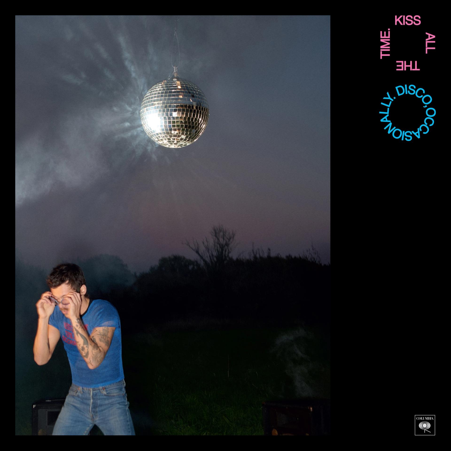
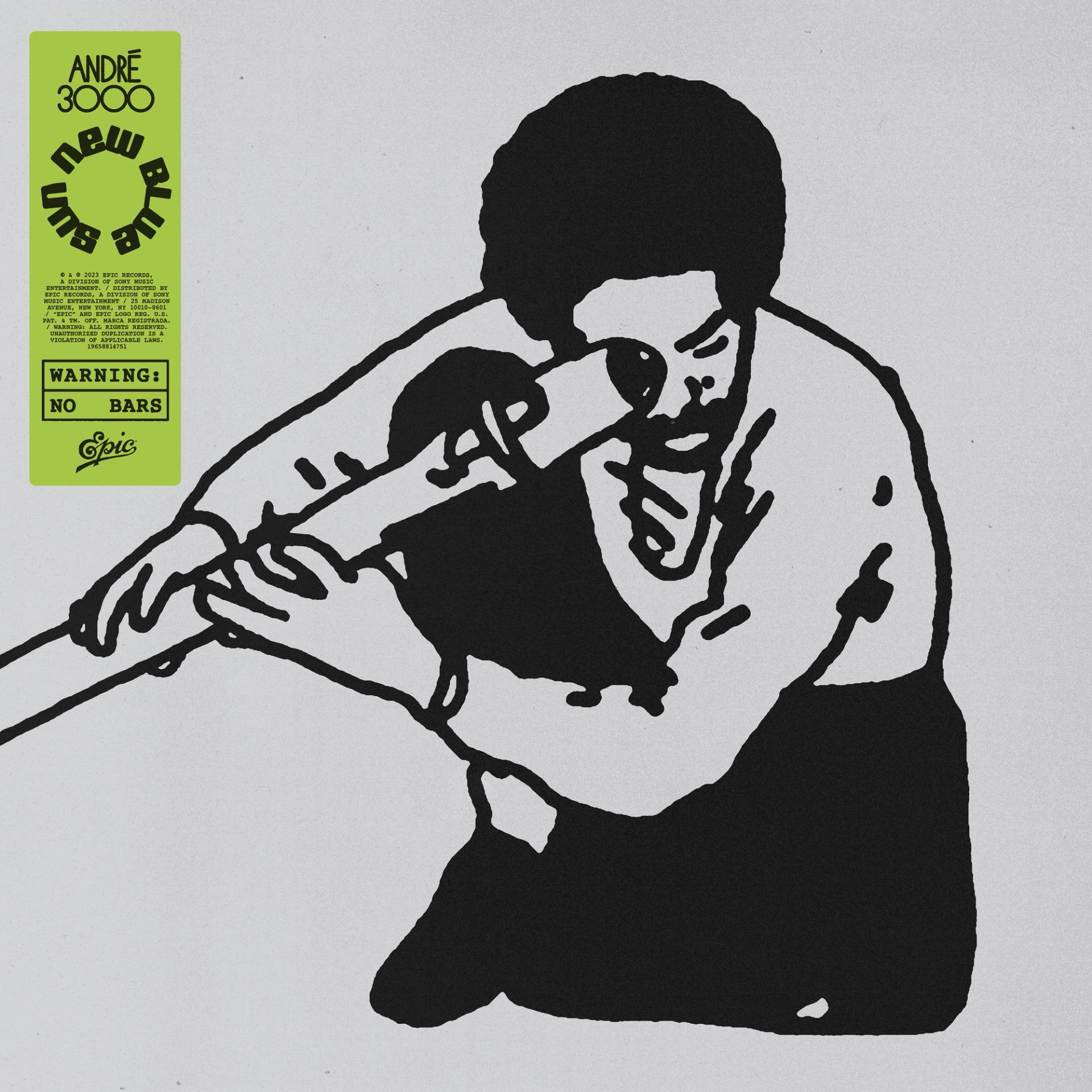
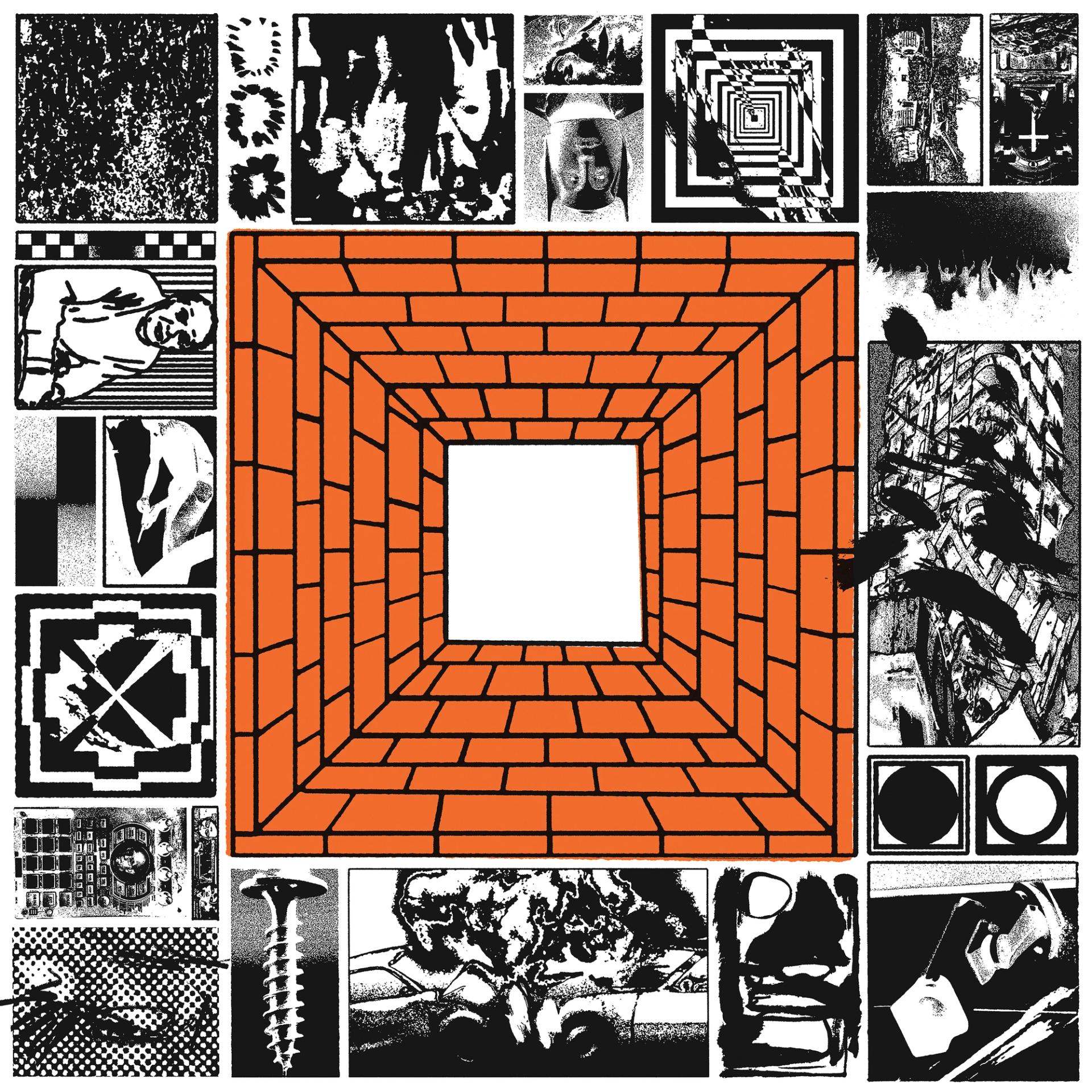
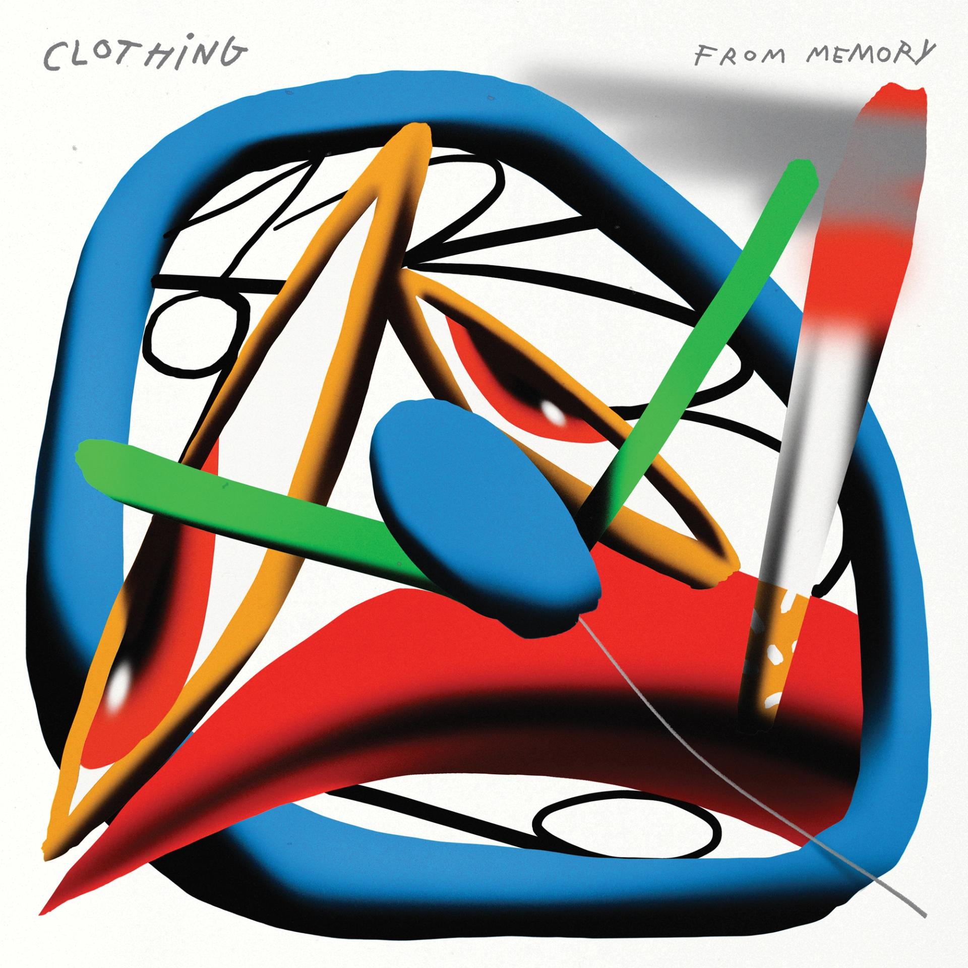
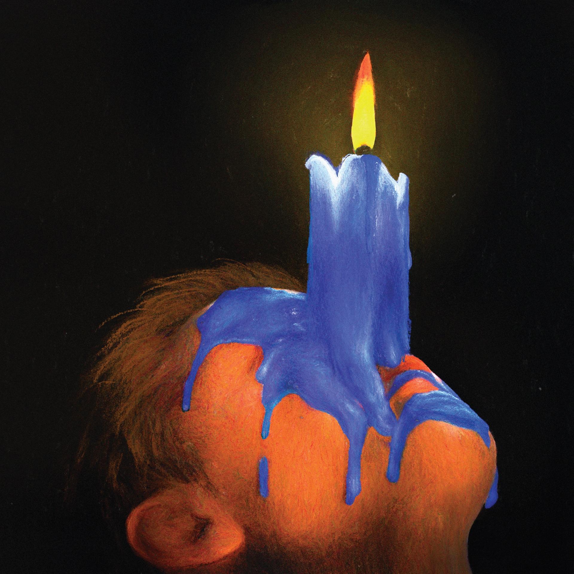
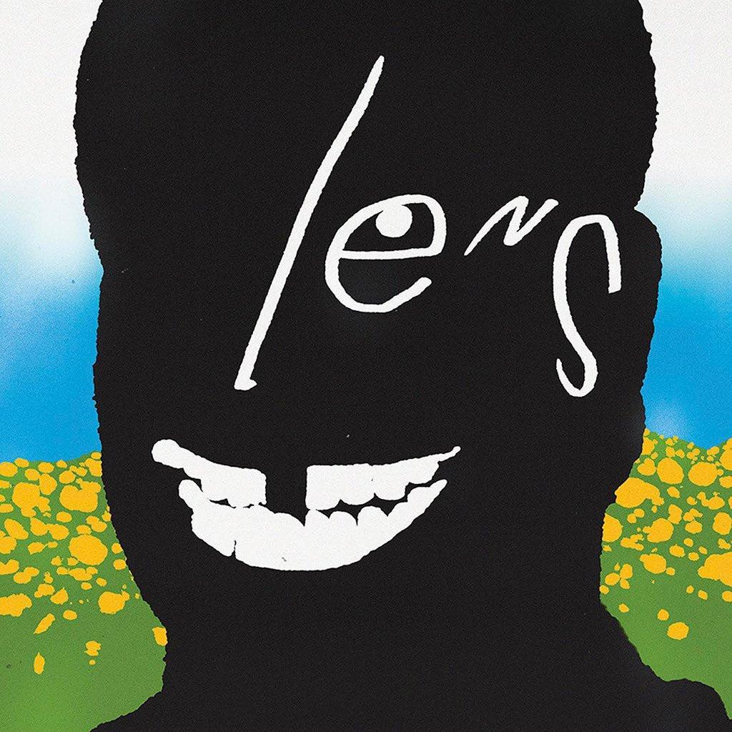
Album covers: Harry Styles, “Kiss All the Time; Disco, Occasionally”; André 3000, “New Blue Sun”; Zeropolis, “1000 Walls”; Clothing, “From Memory”; 72 Hours Post-Flight, “Non-Background Music”; Frank Ocean, “Lens”
On Finding Inspiration in the Process
One of the many things that’s unique to your design work is your ability to make mundane material into art—whether it’s garbage on the sidewalk or a tax return envelope. You make things others wouldn’t give a passing thought into something beautiful and compelling. That’s much harder than it looks.
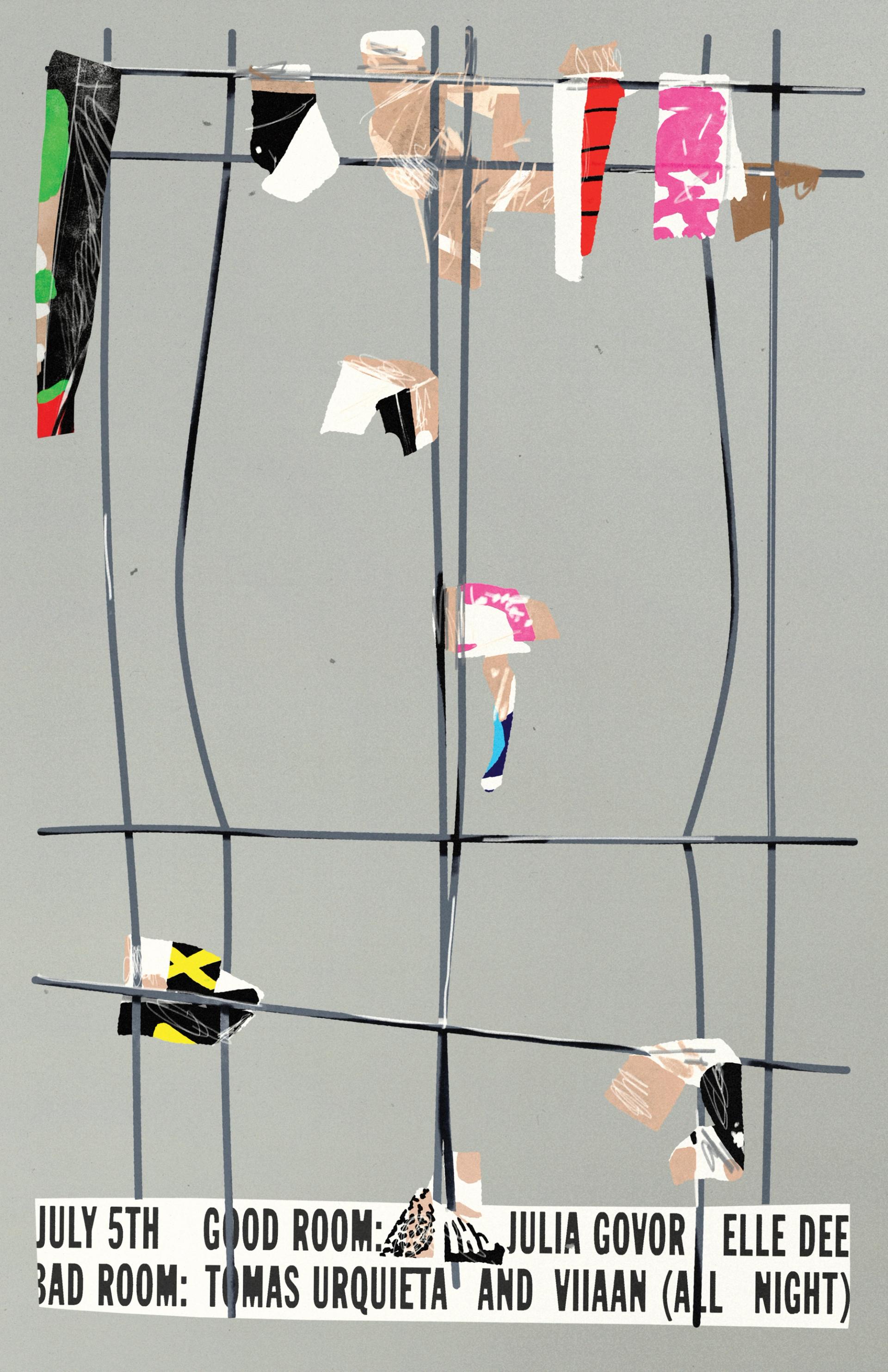
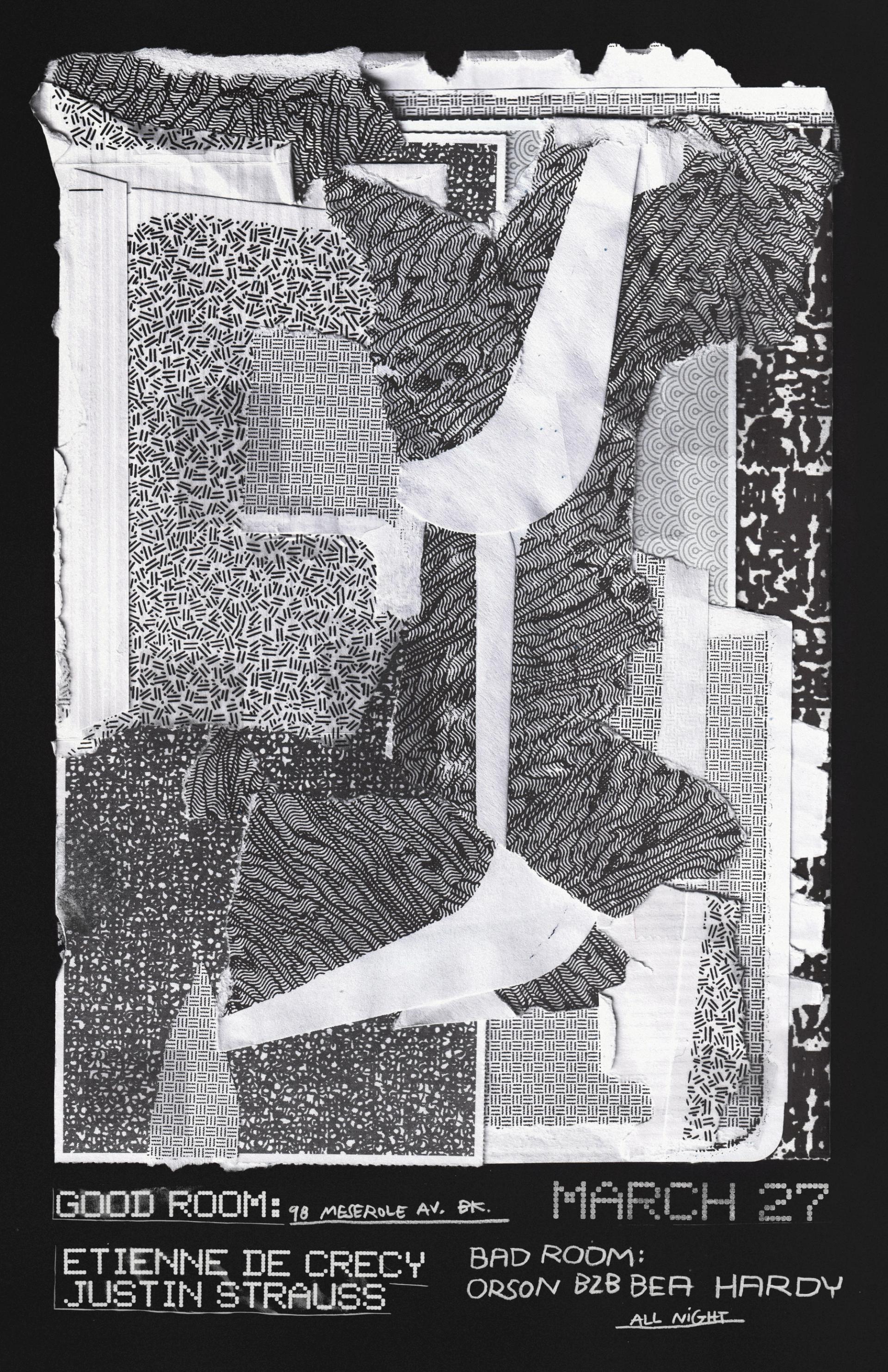
Most of that work is for the nightclub Good Room, and they give me a lot of freedom with their posters. When I started designing for them, they didn’t care much about what I did; they just needed some images to post online. There were so many posters to make, and they don’t have a big budget, so we got to this understanding where I could push things—like make posters really hard to read—and they’d be like, “Cool, this is great, thank you.” I’ve made two or three posters a week for 10 years now. It got to a point where I just ran out of ideas.
One day, I went through my photo album for inspiration and saw this photo of a bagel with cream cheese and salmon. It had this beautiful electric pink, and I made something based on the colors and its vibe.
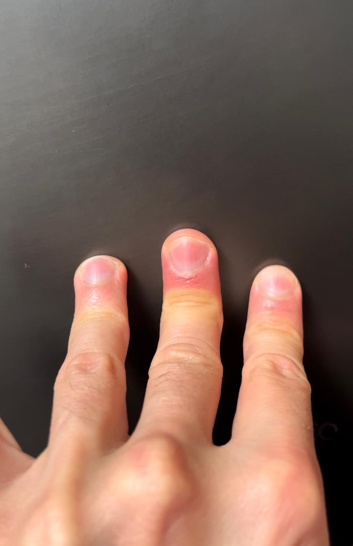
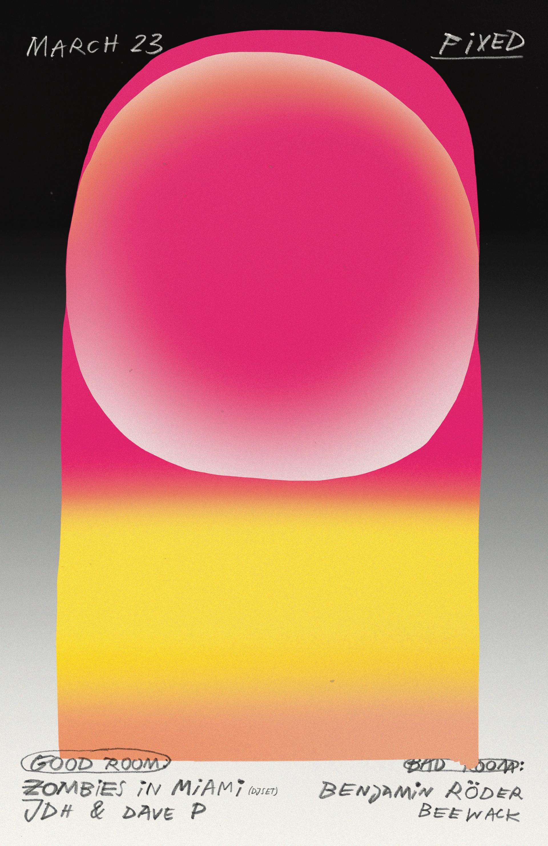
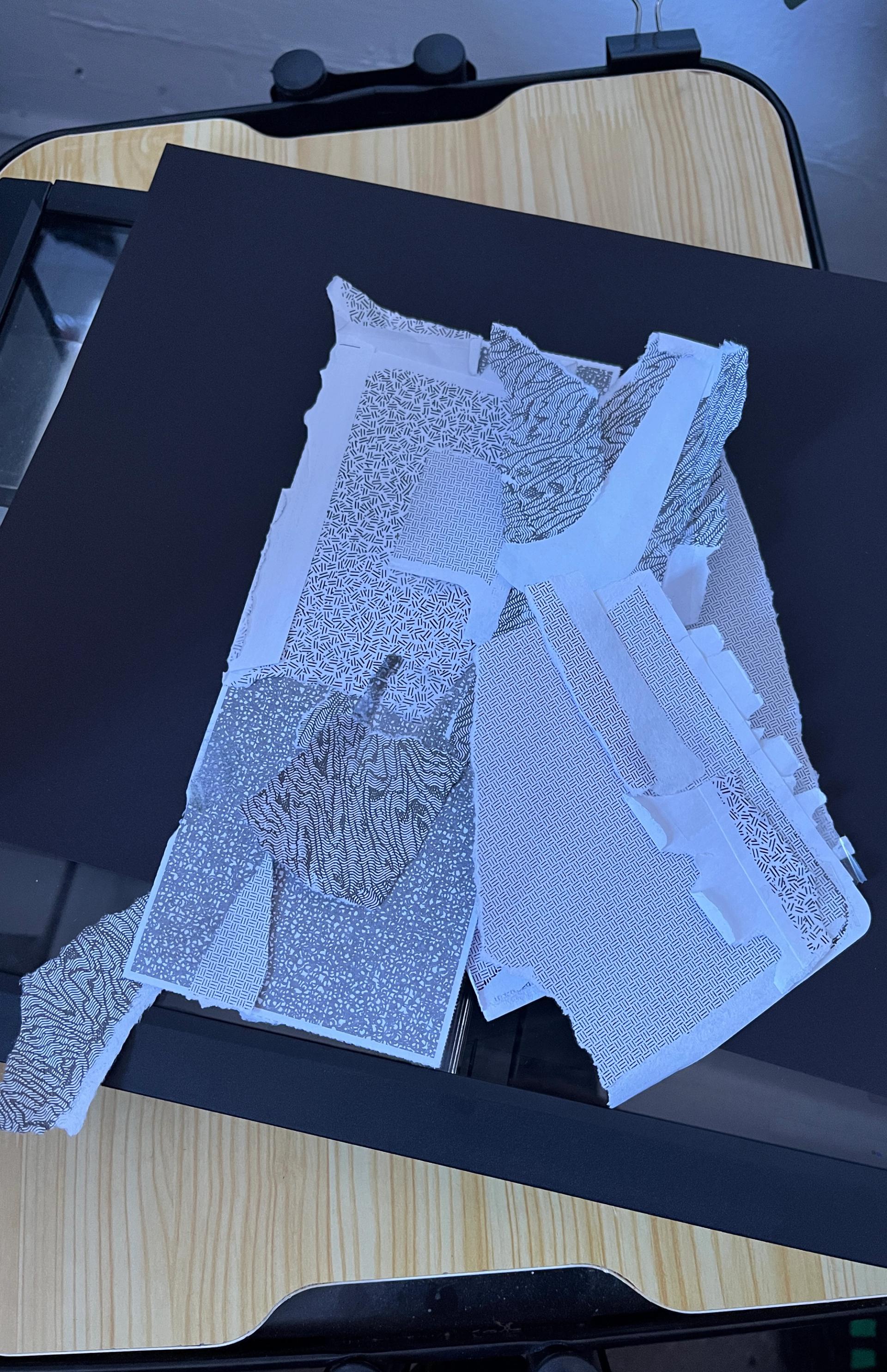
That started this process of using photos I took of random objects as inspiration for a new poster. I started getting more intentional about it, walking the streets and looking for inspiration—but doing that purposefully lost a bit of the fun. Now I just take random photos of things I find interesting, and look through them later. It’s almost like a game. It’s like, “this is the photo, I have to do something with it.” Even if it doesn’t look anything like it in the end, I just have to use it as a starting point. I find it super helpful to have something to riff on. The more boring or uninspired it is, the harder the game gets—which is cool, because you go through these little accidents that push the work toward being something else.
Sometimes people will send me photos saying things like, “This could be a poster!” I love that, but that’s too easy, because they already noticed it and saw potential in it.
Right, it’s about continuous discovery through making, and how putting something through the process of “art” changes it in some way.
Yeah, but also I didn’t invent this. Artists like Andy Warhol and Marcel Duchamp used this kind of technique—I’m just bringing that to design. Design today is so tied up in the concept and the computer, and I feel like there’s so much we can borrow from fine art. Especially now with AI, where you just type what you want, everything feels so idea-driven. It feels good to find something random on the street and try to twist it and give it different meanings, instead of just writing a prompt to get a result.
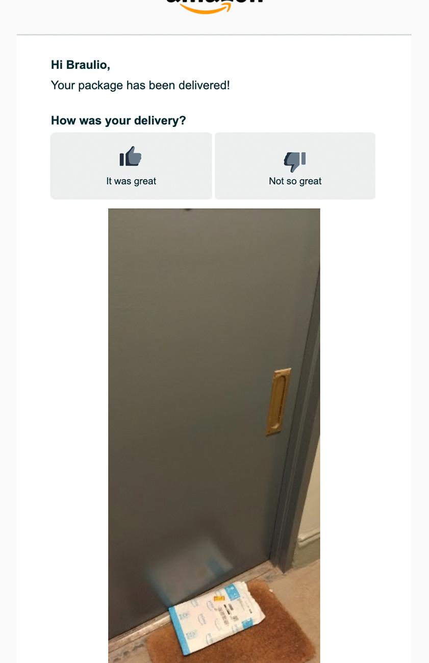
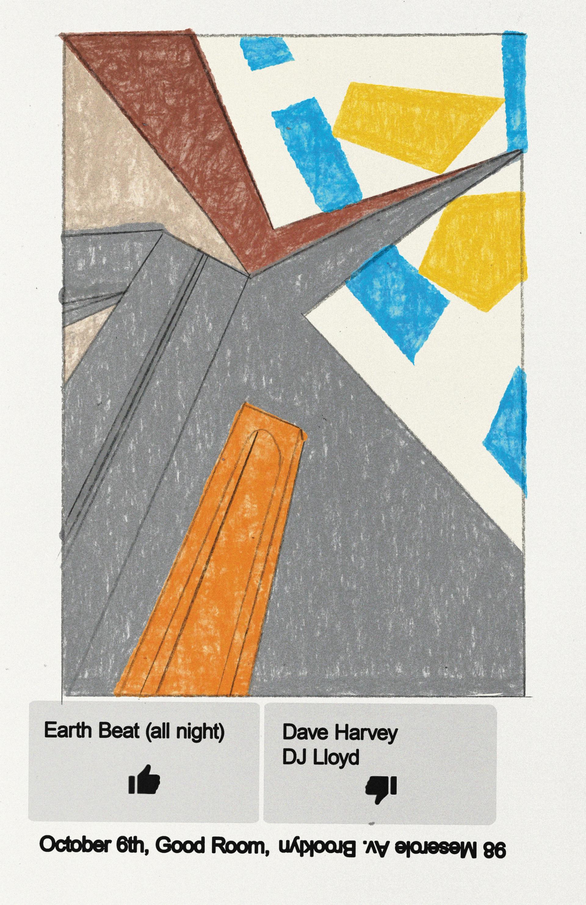
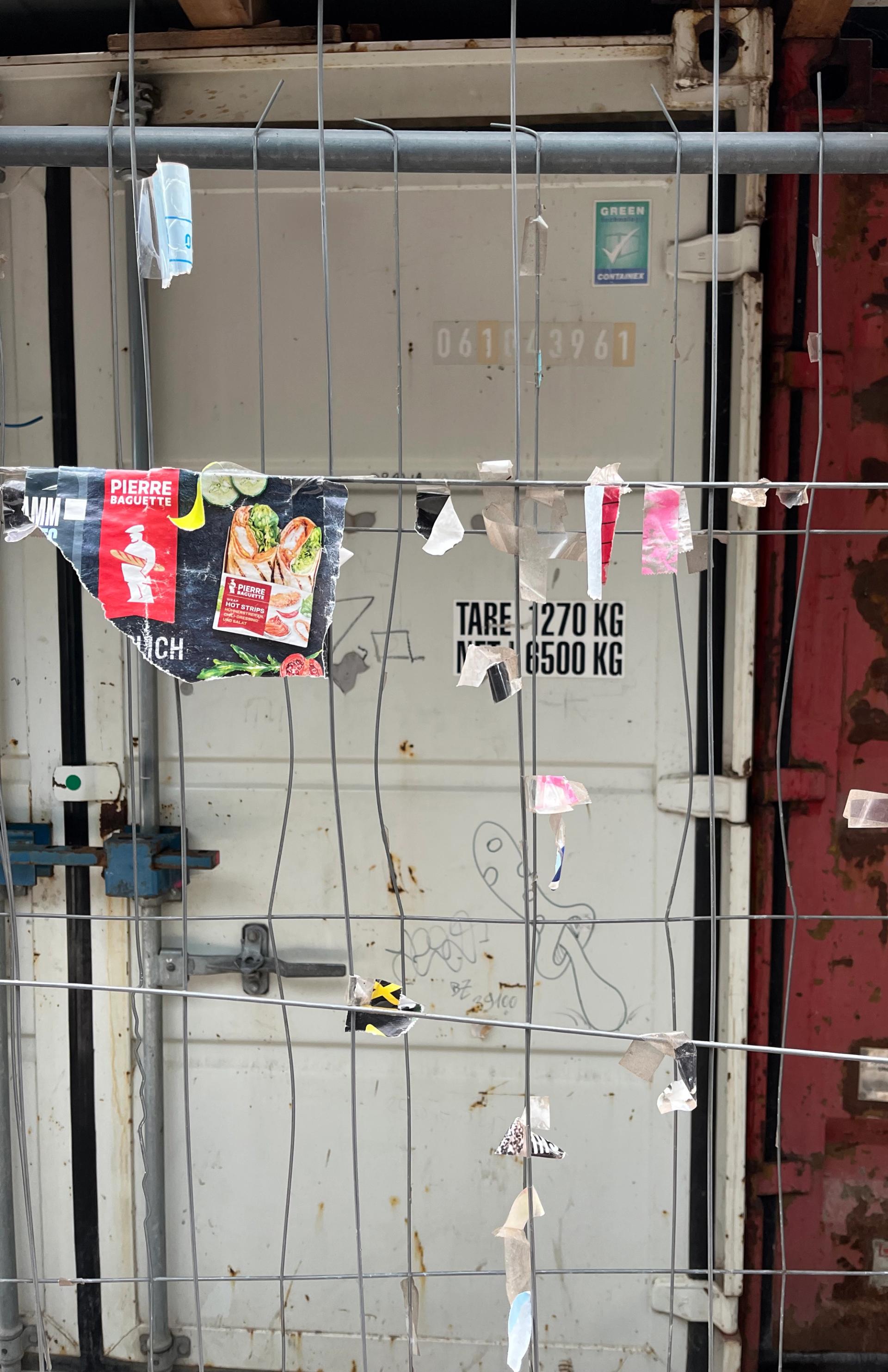
Courtesy of Bráulio Amado.
Your typography style is also very distinctive. The posters you made for the music festival Canela Party have these characters with an almost woven quality, achieved by an outline that’s filled with color. How did you develop this?
When I was 16, I was trying to be a graffiti artist but I was terrible at it [laughs]. One day, some friends and I bought some spray cans and tried to do it on a wall, and it looked terrible. I was like, “Okay, I guess that’s not gonna happen.” But I’ve always loved drawing letters. When I was hired at Businessweek, the creative director, Richard Turley, loved my work but asked me to use a Wacom tablet to make it look less handmade. The first time I drew letters on the tablet, I was like, “Oh, I can do an expressive line and then adjust it so it sits exactly where I want.” That changed the game for me.
How I make letters now, including the Canela stuff, is the same process. I do a little squiggle and adjust it and say, “Okay, that’s going to be a C.” Then I add little pieces to it, like a puzzle. I go letter by letter. I leave all these little pieces open, and I’m making sense of it as I’m writing it. It feels free and playful, but it can also be a big source of anxiety, because I’m like, “I don’t know what I’m doing!” Part of me wishes I had one style that I did really well and that was it.
Is this how you approach your portraits, too?
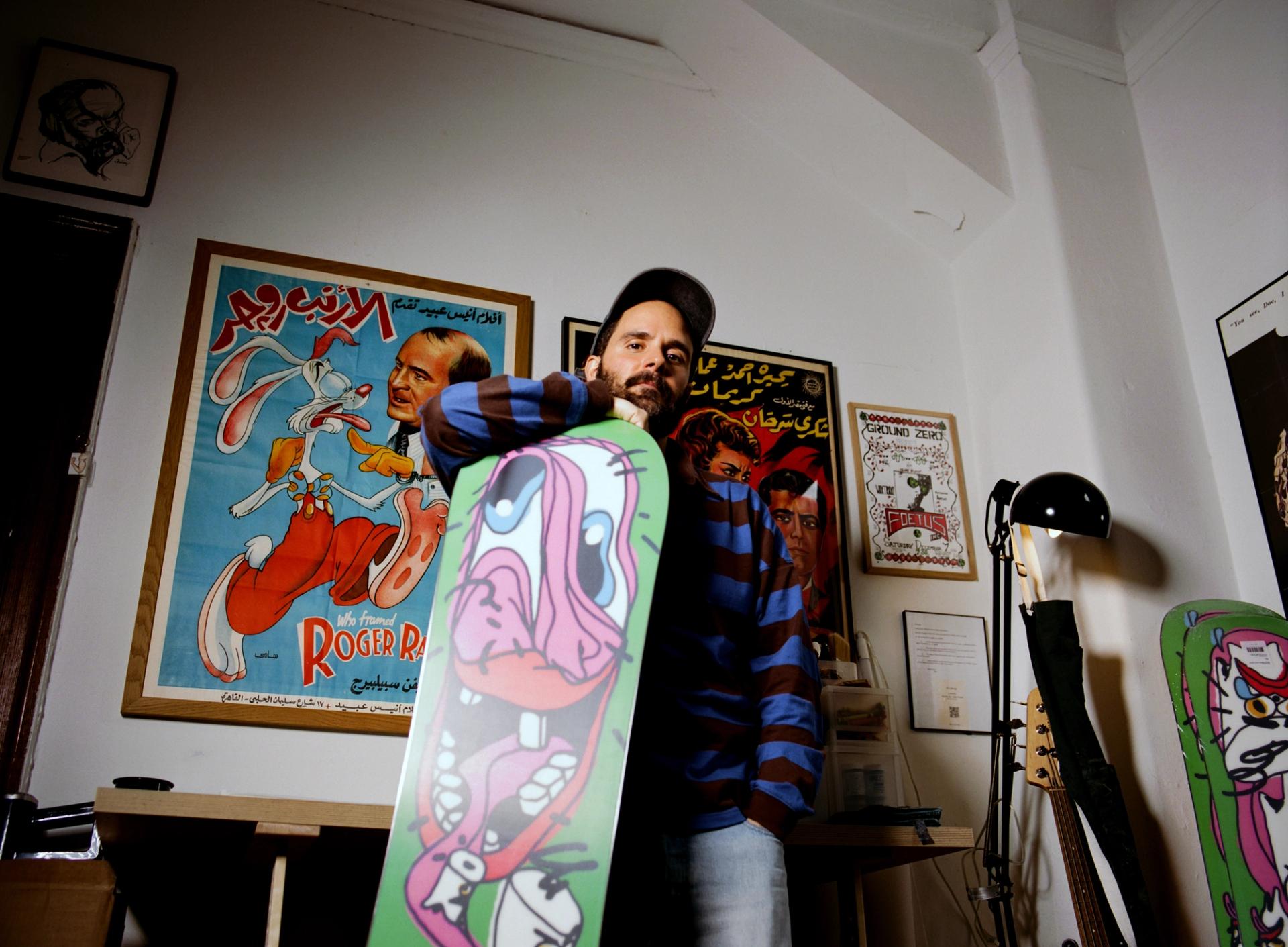
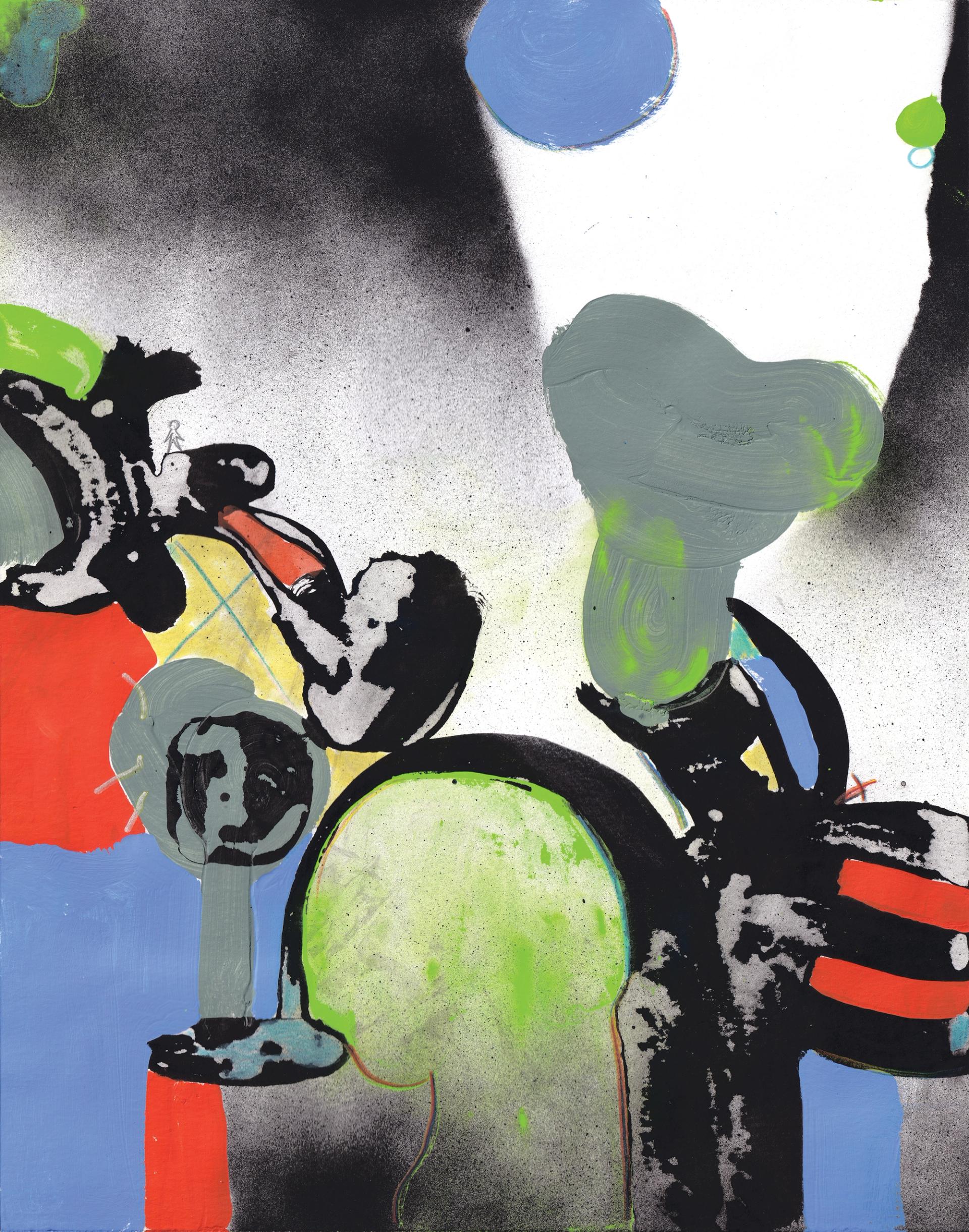
Yeah. For portraits, I get a lot from Peter Saul drawings and from just a bunch of different cartoons—like Who Framed Roger Rabbit. The animation gets kind of deformed and twisted. But the process is very similar to the way I do typography. I start with an eye and then move it around and twist it, then I add a mouth, and it builds from there. If you think of each element of a face as a letter, and I’m trying to make a word out of it, it’s pretty much the same process. Sometimes people say, “We want you to draw this person,” and I don’t actually know how. So I make them super distorted. If I twist them enough, the essence of the person is there, but it’s abstract.
On the Art of Design
The paintings you recently exhibited at FISK Gallery (opens in new window) in Portland feel like they belong in the same aesthetic world as your design work—just liberated from the commercial constraints of having to communicate information for a client. What was the process of creating those paintings?
I do a lot of painting by hand and use analog materials, but I struggle to call myself an artist. Sometimes people ask me if they can have a design piece I’ve made so they can print it out and put it on a wall.
With paintings, I just don’t add text, but the process ends up being kind of the same. Obviously, when I’m making art for an exhibition, I’m not responding to a briefing, so it ends up being a little bit harder. Giving yourself a briefing is kind of daunting. In design, someone might set up a project by saying, “We have this problem, and we want you to solve it.” It’s almost like a game. When it’s me giving myself a briefing, it never feels like a real problem that I have to solve.
Is this the first time you’ve created a series of paintings like this?
I started full-on painting two years ago, and did a show at Commune Gallery in Japan. Initially it was going to be posters and printed works. I usually paint stuff on paper, and then use a computer to make it worse. They knew about my process and asked if I wanted to try making something without a computer. For a few months, I was trying to figure out a way to match what a computer does in real life. There were a lot of accidents and experiments. Then I finally figured out a way, not exactly to do what I do with the computer, but to do something that resembles it with a bit more texture.
With design, I’d draw clean, expressive lines on paper, scan them, and mess them up in Photoshop with textures and overlays to make them richer and weirder. When I started painting—I have no training whatsoever—I was much more precious, and it never resembled my work. Then, once I started loosening up and running water over things and damaging stuff, it was like, “Oh, okay, I found a little of the playfulness again.”
The collection of paintings at FISK are these abstract explorations of form, color, and texture. They use space dynamically, but they also have an organic feel—some of the forms seem inspired by nature. Do you see them the same way, or are they driven by an emotional or other contextual narrative?
My friend Nishad and I came up with the theme and the title of the show: “EXHAUST.” We didn’t have a lot of time, so initially we planned to show work we’d already done under that theme. But then we thought, “Let’s see if we can do a new body of work in an exhausted state.” So the goal was to intentionally not overthink stuff. We were working fast, being spontaneous and expressive.
I started with the black paint first. The first week I was trying out different expressions, messing them up, getting all these different textures, and then I’d take a break and forget about them. A week later, I’d look at the ones with potential and add color, giving them a new interpretation. The process included coloring and adding to it, trying to make sense of what I had done the week prior. I’m trying to play with abstraction and emotion in that way: staying loose and expressive. I like to keep them open to interpretation and not be too prescriptive.
The narrative kind of comes through in the process. I guess it lives in the abstraction. Since I’m working on several paintings at the same time, they talk to each other in a way. I wanted them to feel cohesive.
You’ve also made three-dimensional work, such as a ceramic vase that has the feel of your illustrations. Recently, you’ve launched an exciting collection of furniture. These pieces feel very much in your world, but also like a big expansion of your visual vocabulary. Furniture has specific constraints, such as production and material considerations, as well as requiring a certain level of functionality. Can you tell me how this collection was conceived and executed?
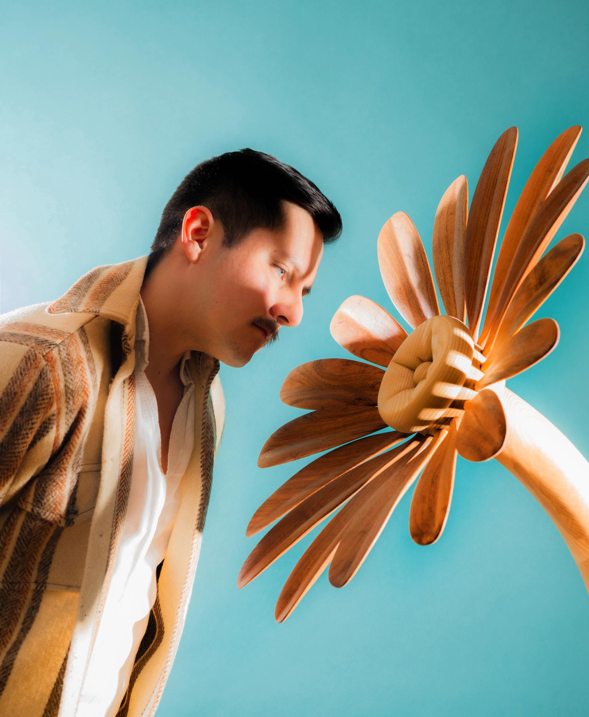
I’m very excited about the furniture. I’m doing them with my friend Pirapha Thongtavee, so it’s two brains bringing different styles and tastes to the table in order to…design a table. A few years ago, when I moved to my studio, I sketched a desk shaped as a guillotine and she turned my scrappy drawing into an insanely beautiful piece of furniture. She not only helped with the design, but she was also the one actually handling the metal, welding, et cetera. We had been talking about collaborating again since then, and even though we exchanged ideas and sketches a couple times over coffee, things only took shape when we met at her studio and started playing with scraps of metal to see what we could do with them.
We started with something functional, but we are not really setting any rules or limits. I feel like we picked our name—Mystery Meat (opens in new window)—to keep things a bit open, be playful, and explore whatever we want, functional or not. But I also just really wanted a new bedside table…
On Keeping It Punk
Music also runs throughout your practice, informing your aesthetics, your client work, and even how you got your start. Tell me about your involvement in music scenes when you were young.
Music was the reason I started making art and design. When I was 14, there used to be these fan sites for bands, all so poorly designed but really fun. I wanted to design things like that. I loved the music and I wanted to express myself and do record covers, but in my own way.
When I started listening to alternative, punk, and hardcore, there was this big DIY aspect to it. A record cover could be a Xerox of a photograph, and the Xerox adds this grain and makes it different. Punk music was the thing that really inspired me to start doing record covers, because there was simplicity to the DIY expressiveness of it. That’s what got me excited. I gravitate towards things that anyone could have done, but they didn’t. I like naive things, things that are super simple, or stuff where we’re all using the same Photoshop filters but doing so many different things with them. When you simplify the tools around creation, and those tools are open to everyone, then we’re all going at it in different ways. Punk music has a lot of that—we’re all riffing on the same references, and everyone is adding their personality to it.
What was the hardcore scene in Portugal like?
In my hometown, Almada, the music scene was different from the one in Lisbon, and I connected more with the one in Lisbon. Lisbon was a bit more, “This is art, and we’re political, and we’re all vegetarians who are gonna fight the system.” My hometown is a suburb—it was more about getting drunk and smoking weed and getting into fights on the streets, kind of hardcore. It was all very macho, and then, because I realized I was gay, I was like, “Oh, I don’t want to be in this scene.”
I joined a band, and we wanted to travel and go on tour, and back then there was still MySpace. So we’d find a band in Madrid and say, “Hey, we’re gonna play in Madrid, can you help us book a show?” Then we’d say, “Okay, now we want to go to Barcelona,” and we’d find a band in Barcelona and do the same. We booked a whole tour by finding bands in different countries that had the same sound as ours, and then we invited them to play in Portugal. Alternative bands very rarely wanted to tour there, so we’d just organize to make our own scene.
I imagine that when you work with musicians on album art, it may change the dynamic a bit, because you’re working with a creative whose main objective is to express their personal ideas, as opposed to an art director who is representing a brand or agency. What does that dialogue look like?
It depends on the artists! Sometimes, the bigger the artist is, the more people are involved behind creative decisions, so the process isn’t that different from a corporate client. And I don’t mean this as a negative thing, or that big artists are not making the final decisions—but I’m normally not texting with the boss. With indie, midsize, and small bands, the relationship is way more direct, and the conversations and process about what we are trying to create is less linear. Sometimes they come to me with an idea already in mind, and sometimes there’s nothing and it’s more about a collaborative adventure.
But also, I love music, and making record covers is my favorite thing to do, so my own excitement and passion around that makes the process very different versus a deck for a brand or something like that.
On Creating Your Own Path
How did you adapt from the DIY ethos of the music scene in Portugal to formally pursuing an education in art and eventually working for a prestigious design firm?
So, I ended up in the US because I got a scholarship to do a semester of studies at SVA. One of my classes was with a partner at Pentagram. After school, I wanted to stay in New York, so I interviewed with him for an internship and didn’t get it, but another designer offered me work in exchange for teaching him Portuguese. I went back to Portugal to graduate and came back for the internship—and the guy never replied to me. I went back to my teacher and asked if he knew anyone who was hiring, and he told me to come to the office the next day. I thought it was just coffee. I got there and he was like, “Okay, you can sit here, and this is what you’re working on. Welcome to Pentagram.”
I worked my ass off, living off dollar-slice pizzas, and learned a lot about clean typography and paragraph styles and how to do things properly.
And then you went to Bloomberg Businessweek, which is where we met. When you got there, you were immediately one of the strongest designers amongst a murderers’ row of designers.
Oh my God, I was so anxious because everything was so fast and Richard Turley wanted me to try different styles every week. Everything I do now, I learned there. We were reacting to real things in the world—even when it was finance stuff or boring stuff I didn’t understand, it was still connected to something real and not just selling something.
Then I was at [advertising agency] Wieden+Kennedy, which had an experimental department, and it slowly became less creative and more client-driven. I realized I didn’t love that sort of thing. I had started doing work for Frank Ocean and I was already doing the Good Room posters, which were getting some attention, and people started asking me to do record covers. That’s when I decided to go freelance.
I was always so impressed by your output. There were periods I assumed you were putting in 80 hours a week to create the amount of quality work you were doing, but it turns out you’re just very fast.
There was a point when I was spending more time making things more perfect, more serious, and more complex—and all of that would get killed. Clients were like, “No, we want the fast, fun, playful things you’re doing with the Good Room posters.” And I’m like, “But I did that in 10 minutes!” I’d feel like a poser. But then I decided to make things like that.
The other strange thing is that, because the Good Room is where I’m testing things, I actually want to develop those ideas further. And when I do, the client would be like, “No, we like the sketch the most.” I wanted to push things forward, but the clients wouldn’t let me—so I got more serious with the posters. They were a way for me to put work out there that I wanted to get hired for.
On Romanticizing the Process
There’s this idea—usually applied to fine art—that nothing we create comes from us. And that people who are great at creating have a stronger connection to a higher source. Has that ever landed for you?
Oh my God, absolutely not [laughs]. When I started drawing, I would see these kids in my class doing it so well—like they came from a different planet, like they had a gift for it—and I’d be so jealous. But with art, there’s centuries, millennia of history of things inspiring people, over and over again. We forget that everything around us was created and generated by someone. Sure, some people have a natural talent with drawing and everything they do looks beautiful—but sometimes when I look at art like that, I think it’s so technical. Like, it’s so beautiful, but I’m not getting anything out of it.
We’re all just humans expressing ourselves with our own limitations and knowledge, or lack of knowledge. As I get older, I feel like art keeps opening me up to new things, and makes me reconsider what is truly beautiful and exciting. That’s what I love about art and creating things—the fact that I’m trying something and think I’m terrible at it, but someone else looks at it and thinks it’s beautiful.
I romanticize it. Art and music can be so inspiring in a religious way, brainwashing us into thinking it’s something from out of this world. But no, everyone has the ability—some people go for it, or have the chance and luck to explore it, and some people are simply not interested in it. The other day, I was with a friend of mine who doesn’t know how to draw and doesn’t care about art. I forced him to draw something, and it was really good. I was like, “Damn it—now when I draw something, I want it to look like that.” Like it was made by someone who hates art, because it comes from such a different place.