Collected

Hong Kong’s Endangered Neons, De Kooning’s Hidden Drawings, and the Perfect Table

What we’re obsessed with this week in craft and culture.

Neon-lit Hong Kong street packed with glowing signs, trams, and streaking traffic at night.
Credit: Keith Macgregor, “HK Neon Fantasies, Hennessy Road” (1987–2018). Courtesy of Blue Lotus Gallery.

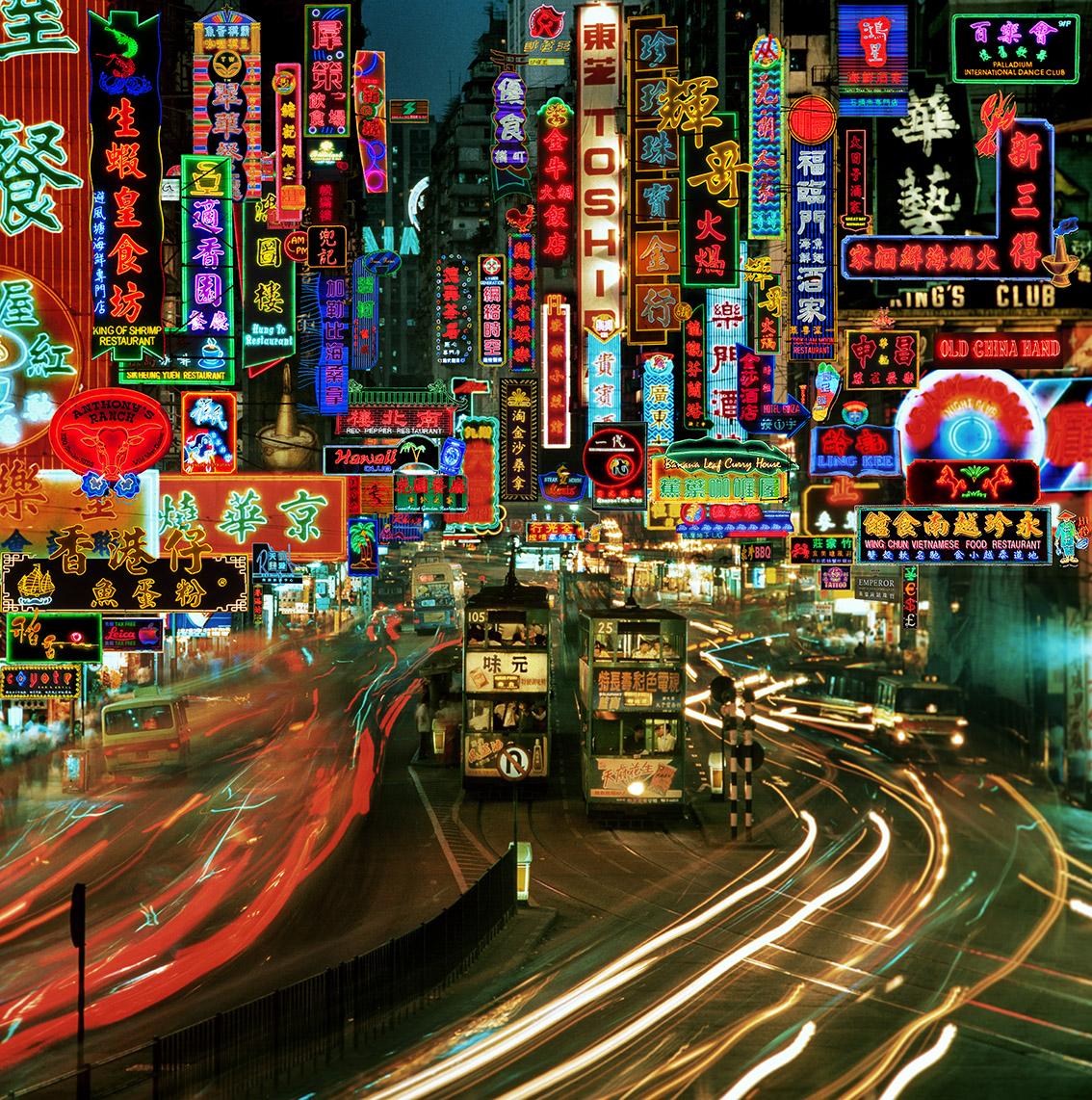
Hong Kong’s endangered neons

When I lived in Hong Kong, I worked and lived for a time in Wanchai, one of the few neighborhoods where you can still find the handcrafted neon signs (opens in new window) that for so many people are a symbol of the city itself and that, before the advent of LED bulbs and modern safety regulations, crowded the streets with their exuberant glow. Almost all the signs have disappeared—fewer than 400 remain, compared with about 100,000 in the neon heyday of the 1980s—but they have been preserved in the work of photographer Keith Macgregor. A selection of images from Macgregor’s archive, dating from the 1980s onward, are being shown for the first time at Blue Lotus Gallery in Hong Kong. The exhibition (opens in new window), which opened today, accompanies the release of City of Lights (opens in new window), a book collecting hundreds of Macgregor’s unpublished photos in glorious full color. Blue Lotus Gallery founder Sarah Van Ingelgom described the book as “a record for future generations” as well as a tribute to the past.

“Hong Kong’s neon was never just signage—it was architecture, theater, and identity suspended above the streets,” Van Ingelgom told me over email. “As these lights vanish, so too does an extraordinary tradition of craftsmanship.”

Hong Kong’s neon signs are hand built by a rapidly diminishing cohort of master glassblowers who bend thin, hollow rods into Chinese characters, Roman script, and even, when the need arises, giant, sharp-toothed fish (opens in new window), before filling the tubes with neon and the other colorful gases that illuminate them. Barely any of these artisans have passed their skills down to the next generation, making archives like Macgregor’s valuable attestations to their handiwork.

Angular man and woman in an expressionistic drawing with vivid pastel colors and abstract forms.
Credit: Willem de Kooning, “Untitled” (c. 1947–48). Private collection. © 2026 The Willem de Kooning Foundation / Artists Rights Society (ARS), New York. Photo courtesy of TAJAN.

Draw me like one of your monumental abstractions

I always enjoy shows that focus on an artist’s works in a medium or format for which they are not well known: Cézanne’s portraits (opens in new window), Helmut Lang’s sculptures (opens in new window), Lucy Liu’s paintings (opens in new window). They may challenge our assumptions about the artist in question, shed new light on their process, or tell us something broader about the nature of creativity: the way a given medium constrains or liberates an artist’s self-expression, the way the same creative impulses manifest on screen versus on canvas, or in pencil rather than oil. The Art Institute of Chicago’s Willem de Kooning Drawing (opens in new window), which opened this week, offers new insight into the work of the abstract expressionist. Famous for his paintings, De Kooning also made drawings and sculptures, both of which are on display alongside their more prominent siblings. The exhibition—the first major showing of his drawings— includes almost 250 works spanning seven decades, including some that have never been publicly displayed.

Clearly, the medium for which he is most renowned was paramount for De Kooning (he called sculpture “painting in three dimensions” (opens in new window)). But the other media open new dimensions in his work. The restless movement of his paintings morphs into something weirder and more strikingly corporeal in his bronze figures (opens in new window). In a charcoal drawing from 1964–65, big-eyed fish, charmingly slapdash, dart across the page, somehow freer in their spareness. Sometimes he drew with his eyes closed. And many of the works in the exhibition are “hybrid,” blending paint and pencil together.

“Defining a drawing can be difficult with De Kooning,” curator Kevin Salatino told me via email, but, “there is a graphic sensibility running through all his art.” De Kooning often employed tracing and transfer techniques that he picked up in art school in Rotterdam and at the design firms where he worked early on. In many of his paintings, said Salatino, drawings are “hidden beneath the dense surfaces.” He added, “Drawing lay at the base of everything he did, and, in his drawings, we see the artist thinking with his hand.”

A wooden table with a colorful mosaic top.
Credit: Jogakbo Side Table 2. Courtesy of D-Haene Studio and The Future Perfect.

Patchwork tables

It was the side table (opens in new window) that first caught my eye—the pleasing rectilinearity, the quiltlike ceramic tiles, and the legs that jut outward and hold the tabletop so lightly that it seemed to float, like a finger-lift party trick. Small wonder that D-Haene Studio’s debut furniture collection came about through a collaboration between a ceramicist and an architect. The former is Jane Yang-D’Haene, and the latter is her husband, Francis D’Haene, who died in January. Poignantly, the collection was the couple’s first creative collaboration. Yang-D’Haene, who is known for her off-kilter moon jar pieces, created gorgeous glazed surfaces made up of irregular, multicolored tiles in the manner of jogakbo, a traditional Korean patchwork technique. And D’Haene’s architectural sensibility blooms in the structural details of the tables and their accompanying console and credenza. The collection is on view in an exhibition (opens in new window) at The Future Perfect in New York until June 26.

Join our community